matplotlib能绘制出很多2D,一部分3D图片。
#导入
import matplotlib.pyplot as plt
绘图的接口基本上都是放在pyplot中,绘制线形图示例如下
# plot
plt.plot(*args, scalex=True, scaley=True, data=None, **kwargs)
# Plot y versus x as lines and/or markers.
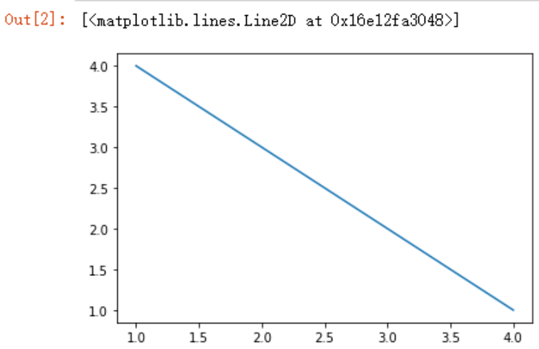
x = [1,2,3,4]
y=[4,3,2,1]
plt.plot(x,y)
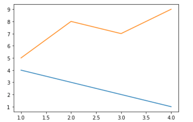
如何在一张图上绘制出两个图形?
x = [1,2,3,4]
y=[4,3,2,1]
y1=[5,8,7,9]
plt.plot(x,y)
plt.plot(x,y1)
plt.show()
绘制柱状图
#plt.bar?
plt.bar(
    x,
    height,
    width=0.8,
    bottom=None,
    *,
    align='center',
    data=None,
    **kwargs,
)
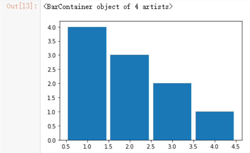
示例如下:
plt.bar(x,y,width=0.9)
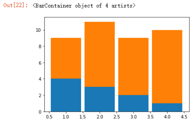
如果想要将两个柱状图画在一起,可使用bottom参数
#示例
plt.bar(x,y,width=0.9)
plt.bar(x,y1,width=0.9,bottom=y)
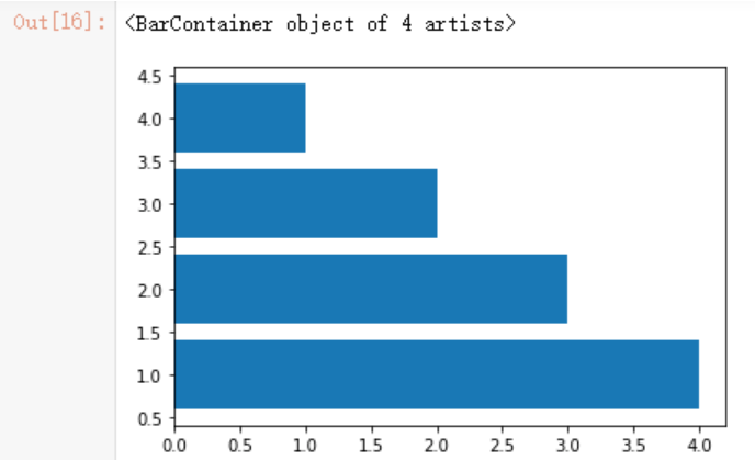
如果想要将柱状图横着画,可采用barh函数
plt.barh(x,y)
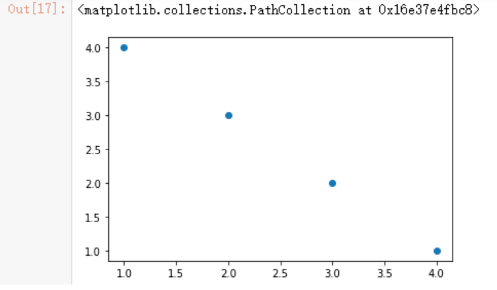
绘制散点图
plt.scatter(
    x,
    y,
    s=None,
    c=None,
    marker=None,
    cmap=None,
    norm=None,
    vmin=None,
    vmax=None,
    alpha=None,
    linewidths=None,
    verts=<deprecated parameter>,
    edgecolors=None,
    *,
    plotnonfinite=False,
    data=None,
    **kwargs,
)
# 示例
plt.scatter(x,y)
如何自定义绘图的线型和标签
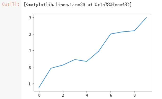
定义测试数据
y = np.random.randn(10).cumsum()
y
>array([-1.23938019, -0.07680125,  0.11498539,  0.45118181,  0.33669326,
        0.95620603,  1.99874908,  2.12886301,  2.19477041,  2.99524368])
常规绘图
plt.plot(y)
文档介绍,以下只罗列出参数名,参数对应的属性值可自行百度
Properties:
agg_filter: a filter function, which takes a (m, n, 3) float array and a dpi value, and returns a (m, n, 3) array
alpha: float or None
animated: bool
antialiased or aa: bool
clip_box: `.Bbox`
clip_on: bool
clip_path: Patch or (Path, Transform) or None
color or c: color
contains: unknown
dash_capstyle: {'butt', 'round', 'projecting'}
dash_joinstyle: {'miter', 'round', 'bevel'}
dashes: sequence of floats (on/off ink in points) or (None, None)
data: (2, N) array or two 1D arrays
drawstyle or ds: {'default', 'steps', 'steps-pre', 'steps-mid', 'steps-post'}, default: 'default'
figure: `.Figure`
fillstyle: {'full', 'left', 'right', 'bottom', 'top', 'none'}
gid: str
in_layout: bool
label: object
linestyle or ls: {'-', '--', '-.', ':', '', (offset, on-off-seq), ...}
linewidth or lw: float
marker: marker style string, `~.path.Path` or `~.markers.MarkerStyle`
markeredgecolor or mec: color
markeredgewidth or mew: float
markerfacecolor or mfc: color
markerfacecoloralt or mfcalt: color
markersize or ms: float
markevery: None or int or (int, int) or slice or List[int] or float or (float, float) or List[bool]
path_effects: `.AbstractPathEffect`
picker: unknown
pickradius: float
rasterized: bool or None
sketch_params: (scale: float, length: float, randomness: float)
snap: bool or None
solid_capstyle: {'butt', 'round', 'projecting'}
solid_joinstyle: {'miter', 'round', 'bevel'}
transform: `matplotlib.transforms.Transform`
url: str
visible: bool
xdata: 1D array
ydata: 1D array
zorder: float
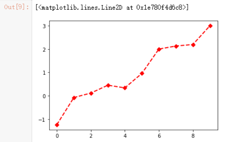
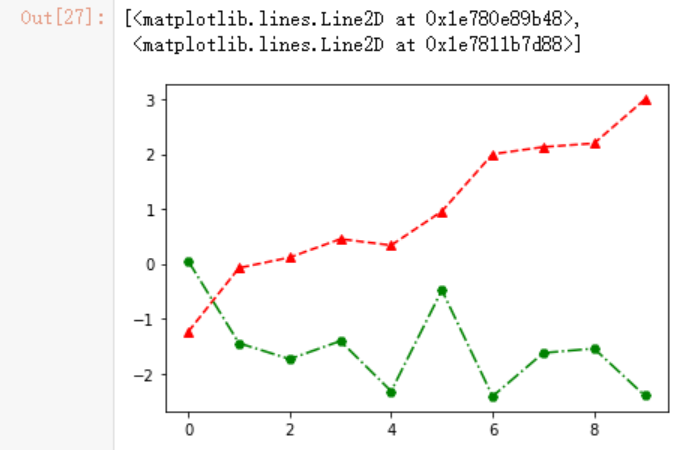
例如我想绘制一个虚线,稍微宽一点,点所在位置打上特殊符号,红色线条的图:
plt.plot(y,linestyle="--",linewidth=2,marker='D',color="r")
# 简写形式
plt.plot(y,ls="--",lw=2,marker='D',c="r")
当然还有更简洁的方式,将“线条风格,颜色,标识符”放入到一起,例如
x = np.arange(10)
y1 = np.random.randn(10).cumsum()
#设置线条风格,颜色,标识符
plt.plot(x,y,'--r^',x,y1,'-.gH',lw=2)
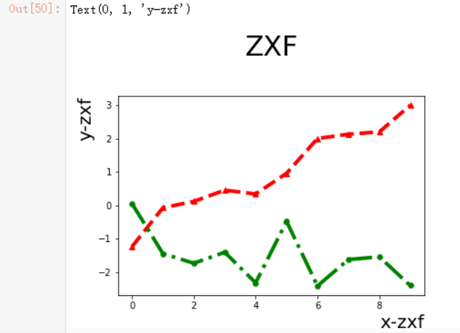
如何设置标题及xy轴的标签呢?
Signature:
plt.title(label, fontdict=None, loc=None, pad=None, *, y=None, **kwargs)
# 代码如下
plt.title("ZXF",fontdict ={"fontsize":30},loc ='center',y=1.2,pad=1)
plt.xlabel("x-zxf",fontdict ={"fontsize":20},loc ='right')
plt.ylabel("y-zxf",fontdict ={"fontsize":20},loc ='top')
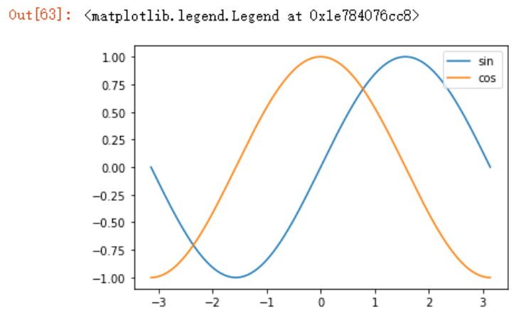
设置绘图的刻度
准备工作如下:
x = np.linspace(-np.pi, np.pi,256)
y = np.sin(x)
y1= np.cos(x)
绘制带有图标的函数图
plt.plot(x,y,label="sin")
plt.plot(x,y1,label="cos")
# 显示图标
plt.legend(loc="upper right") # loc=1
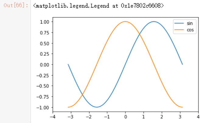
自定义轴的范围
# 利用xlim
plt.xlim(*args, **kwargs)
Docstring:
Get or set the x limits of the current axes.
Call signatures::
    left, right = xlim()  # return the current xlim
    xlim((left, right))   # set the xlim to left, right
    xlim(left, right)     # set the xlim to left, right
plt.plot(x,y,label="sin")
plt.plot(x,y1,label="cos")
plt.xlim((-4,4))
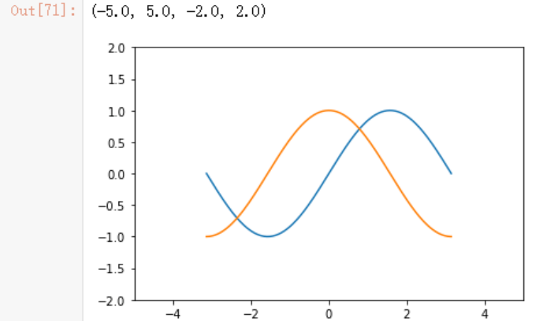
我们也可以使用plt.axis函数来修改(获取或设置一些轴属性的便捷方法)。
plt.plot(x,y,label="sin")
plt.plot(x,y1,label="cos")
#xmin, xmax, ymin, ymax = axis([xmin, xmax, ymin, ymax])
plt.axis([-5,5,-2,2])
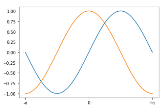
自定义轴的刻度(上面的例子中没有设置默认间隔为1),可以使用plt.xticks函数,这个函数需要两个至少两个参数,一个为定义的刻度位置,另外一个为定义的刻度标签。
#文档如下
plt.xticks(ticks=None, labels=None, **kwargs)
Get or set the current tick locations and labels of the x-axis.
示例代码如下
plt.plot(x,y,label="sin")
plt.plot(x,y1,label="cos")
plt.xticks(ticks=[-np.pi,0,np.pi],labels=['-π',"0","+π"])
如何绘制多图
如何在一张图上绘制多张子图呢?这和上面介绍的bar绘制方法并不一样,bottom参数只是将两个数据绘制在一个图上,绘制子图需要使用subplot函数,我们先来看下官方文档的介绍
Signature: plt.subplot(*args, **kwargs)
Docstring:
Add a subplot to the current figure.

Call signatures::

   subplot(nrows, ncols, index, **kwargs)
   subplot(pos, **kwargs)
   subplot(**kwargs)
   subplot(ax)

Parameters
----------
*args : int, (int, int, *index*), or `.SubplotSpec`, default: (1, 1, 1)
    The position of the subplot described by one of

    - Three integers (*nrows*, *ncols*, *index*). The subplot will take the
      *index* position on a grid with *nrows* rows and *ncols* columns.
      *index* starts at 1 in the upper left corner and increases to the
      right. *index* can also be a two-tuple specifying the (*first*,
      *last*) indices (1-based, and including *last*) of the subplot, e.g.,
      ``fig.add_subplot(3, 1, (1, 2))`` makes a subplot that spans the
      upper 2/3 of the figure.
    - A 3-digit integer. The digits are interpreted as if given separately
      as three single-digit integers, i.e. ``fig.add_subplot(235)`` is the
      same as ``fig.add_subplot(2, 3, 5)``. Note that this can only be used
      if there are no more than 9 subplots.
    - A `.SubplotSpec`.

Examples
--------
::

    plt.subplot(221)

    # equivalent but more general
    ax1=plt.subplot(2, 2, 1)

    # add a subplot with no frame
    ax2=plt.subplot(222, frameon=False)

    # add a polar subplot
    plt.subplot(223, projection='polar')

    # add a red subplot that shares the x-axis with ax1
    plt.subplot(224, sharex=ax1, facecolor='red')

    # delete ax2 from the figure
    plt.delaxes(ax2)

    # add ax2 to the figure again
    plt.subplot(ax2)
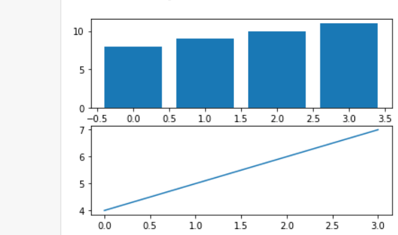
示例代码如下:
x = np.arange(4)
y = np.arange(4,8)
y1 = np.arange(8,12)
#默认增加下方的代码
# plt.figure()
#定义2行1列的主图,先绘第二张子图
plt.subplot(2,1,2)
plt.plot(x,y)
plt.subplot(2,1,1)
plt.bar(x,y1)
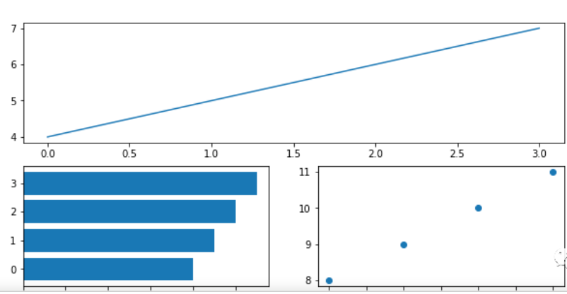
如果子图过多,想要突出显示某一个子图怎么办呢?官方文档里面也写的很清楚了,在索引字段内进行修改,示例代码如下,下方第二个子图如果不进行注释,也不会报错,只是会将第一个子图覆盖掉,道理也好理解
plt.subplot(2,2,(1,2))
plt.plot(x,y)
# plt.subplot(2,2,2)
# plt.bar(x,y1)
plt.subplot(2,2,3)
plt.barh(x,y1)
plt.subplot(2,2,4)
plt.scatter(x,y1)
可以看到确实完成了要求,但也有一个骚操作可以完成这个要求,我们可以这样想,如果我们把这个画布看做一个整体,把它划分为上下两块子图,上子图的位置理应是第1行1列的第1位(2,1,1),下面的两个子图按照它们的定义应该为第2行第1列的第3个子图(2,2,3),和第2行第2列的第4个子图(2,2,4),按照这种画法,代码如下,我也绘制成功
plt.subplot(2,1,1)
plt.plot(x,y)
plt.subplot(2,2,3)
plt.barh(x,y1)
plt.subplot(2,2,4)
plt.scatter(x,y1)
如果想自定义主图,例如大小,可以考虑在plt.figure()函数中定义,照例来看下plt.figure()的介绍:
plt.figure(
    num=None,
    figsize=None,
    dpi=None,
    facecolor=None,
    edgecolor=None,
    frameon=True,
    FigureClass=<class 'matplotlib.figure.Figure'>,
    clear=False,
    **kwargs,
)
示例代码
plt.figure(figsize=(10,5))
#定义2行2列的主图
plt.subplot(2,2,1)
plt.plot(x,y)
plt.subplot(2,2,2)
plt.bar(x,y1)
plt.subplot(2,2,3)
plt.barh(x,y1)
plt.subplot(2,2,4)
plt.scatter(x,y1)
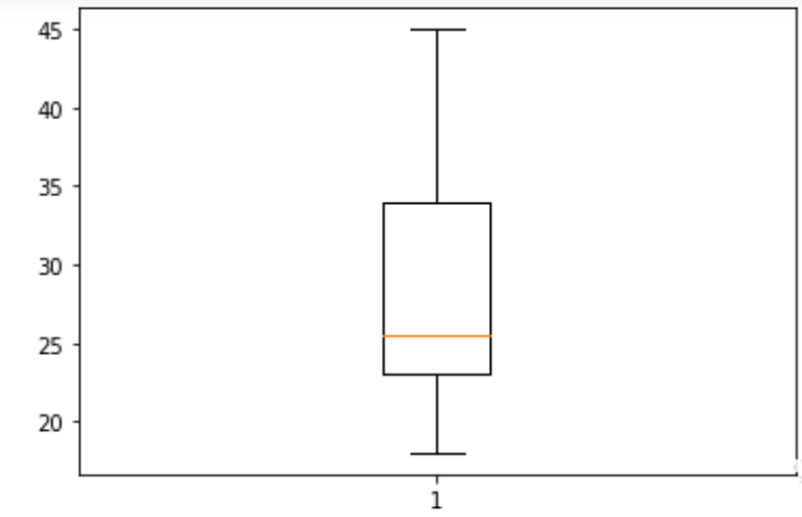
关于箱型图、直方图和饼图
箱型图,可以很清晰的看到数据中最大/小值,中位数,1/4和3/4的的数据分布。
示例代码如下:
data = [23,22,23,45,22,34,23,26,24,25,28,36,34,23,21,26,39,42,37,27,20,18]
plt.boxplot(data)
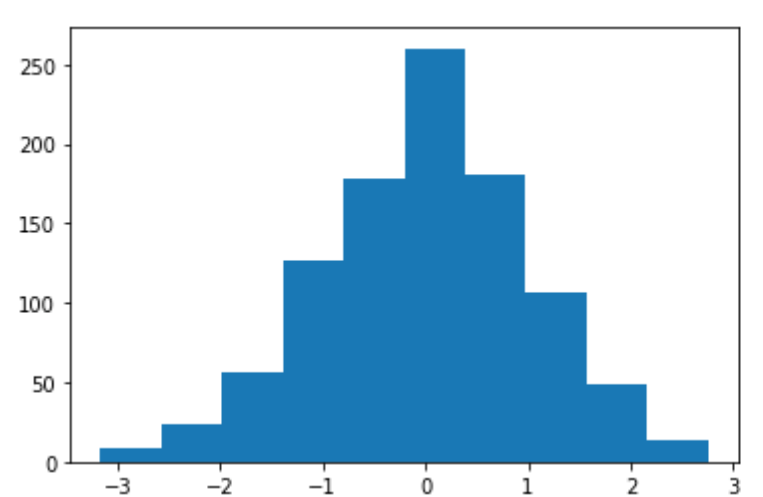
直方图(histogram)的绘制hist,先来看下hist接收的参数
Signature:
plt.hist(
    x,
    bins=None,
    range=None,
    density=False,
    weights=None,
    cumulative=False,
    bottom=None,
    histtype='bar',
    align='mid',
    orientation='vertical',
    rwidth=None,
    log=False,
    color=None,
    label=None,
    stacked=False,
    *,
    data=None,
    **kwargs,
)
示例代码如下:
x = np.random.randn(1000)
plt.hist(x)
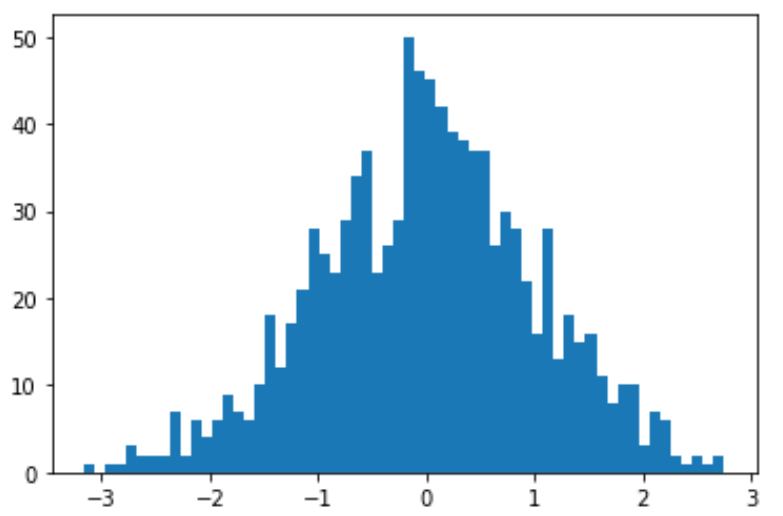
如果想要自定义直方图的划分区间,可以使用bins参数,下方代码将x里面数据汇总之后分成了60组,其中与0挨近的值最多有50个,而3和-3附近最少,1000个数值的分布情况,一目了然:
bins = 60
plt.hist(x,bins=bins)
饼状图pie,参数如下:
Signature:
plt.pie(
    x,
    explode=None,
    labels=None,
    colors=None,
    autopct=None,
    pctdistance=0.6,
    shadow=False,
    labeldistance=1.1,
    startangle=0,
    radius=1,
    counterclock=True,
    wedgeprops=None,
    textprops=None,
    center=(0, 0),
    frame=False,
    rotatelabels=False,
    *,
    normalize=None,
    data=None,
)
示例代码:
y = np.arange(1,5)
plt.pie(y)

但是这种太单调了,我们可以为其添加标签,labels参数接收一个list参数
y = np.arange(1,5)
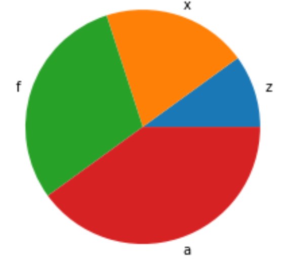
plt.pie(y,labels=list("zxfa"))
上面很清楚的可以看到图形是默认从x轴逆时针绘制的,官方文档中的介绍如下:
The wedges are plotted counterclockwise, by default starting from the x-axis.
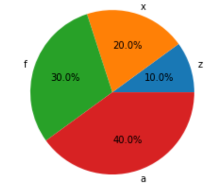
autopct为饼状图增加所占百分比
y = np.arange(1,5)
plt.pie(y,labels=list("zxfa"),autopct="%.1f%%")
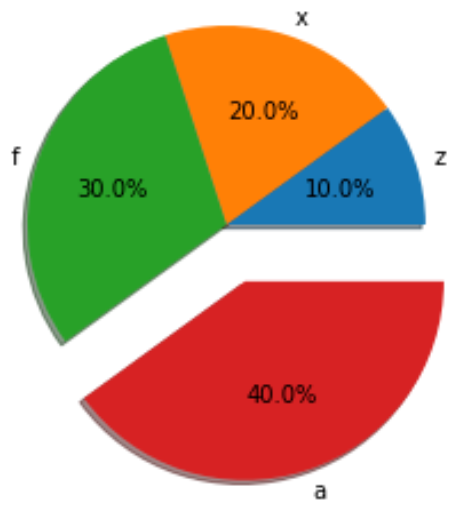
explode指定所有小板块偏移的分数
y = np.arange(1,5)
plt.pie(y,explode=[0,0,0,0.3],shadow=True)
plt.show()
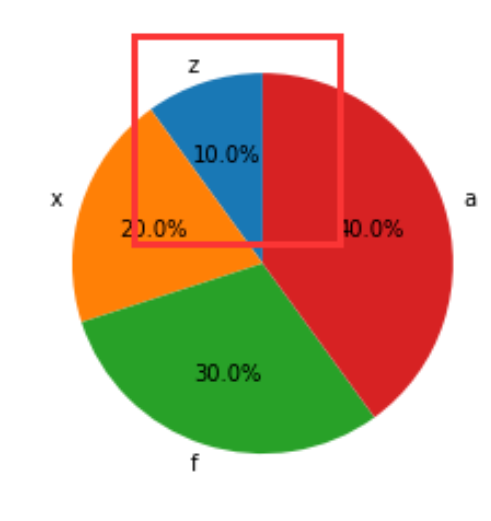
startangle指定绘制开始的角度,例如从y轴开始绘制
plt.pie(y,labels=list("zxfa"),autopct="%.1f%%",startangle=90)
面向对象的matplotlib绘图
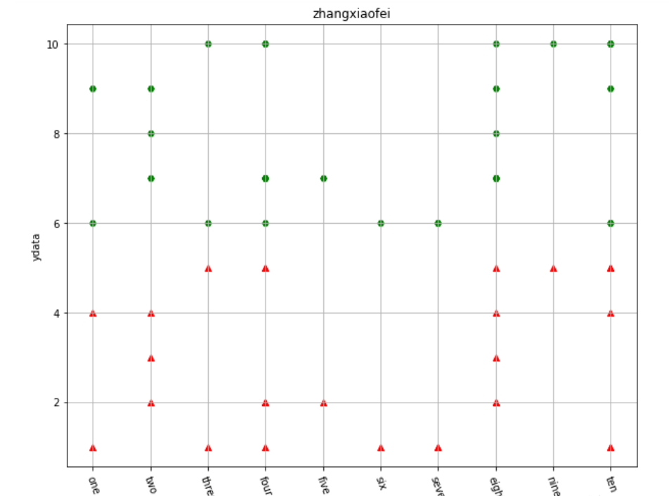
先看下常规绘图的示例
x = np.random.randint(1,11,30)
y = np.random.randint(1,6,30)
y1 = y+5

plt.figure(figsize=(10,8))
plt.scatter(x,y,label="one",color='r',marker='^')
plt.scatter(x,y1,label="two",color='g',marker='H')

x_ticks_label=['one','two','three','four','five','six','seven','eight','nine','ten']
#rotation设置标签旋转,以免重叠在一起
plt.xticks(np.arange(1,11),x_ticks_label, rotation=-70)
#添加表格
plt.grid(True)
plt.xlabel('xdata')
plt.ylabel('ydata')
plt.title('zhangxiaofei')
plt.show()
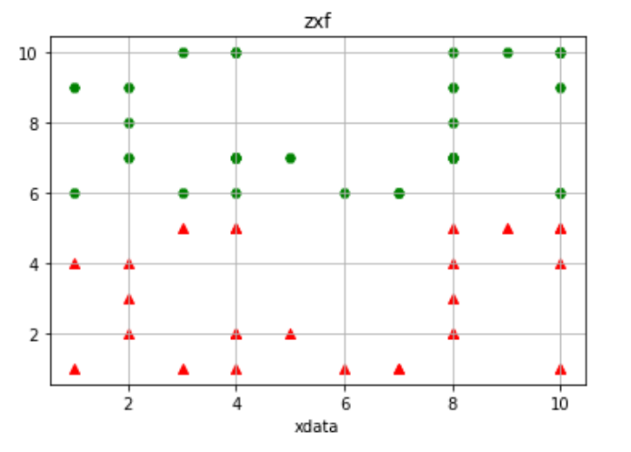
如果想使用面向对象的绘图方法,则必须先初始化绘图对象
#subplots
fig,ax = plt.subplots()
# 使用ax对象来绘制
ax.scatter(x,y,label="one",color='r',marker='^')
ax.scatter(x,y1,label="two",color='g',marker='H')
ax.set_xlabel('xdata')
ax.set_title('zxf')
ax.grid(True)
如果使用面向对象的方法绘制子图,略有不同,如下
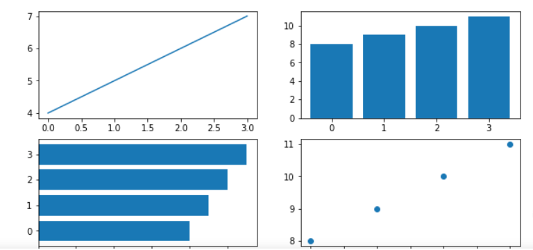
x = np.arange(1,5)
y = np.arange(6,10)
y1 = np.arange(15,19)
# 绘制两行两列子图
fig,axs = plt.subplots(2,2, figsize=(8,8))
#取索引来绘图
axs[0][0].bar(x,y)
axs[0][1].barh(x,y)
axs[1][0].scatter(x,y)
axs[1][1].plot(x,y)
#让图形不那么拥挤,自动缩放
plt.tight_layout()
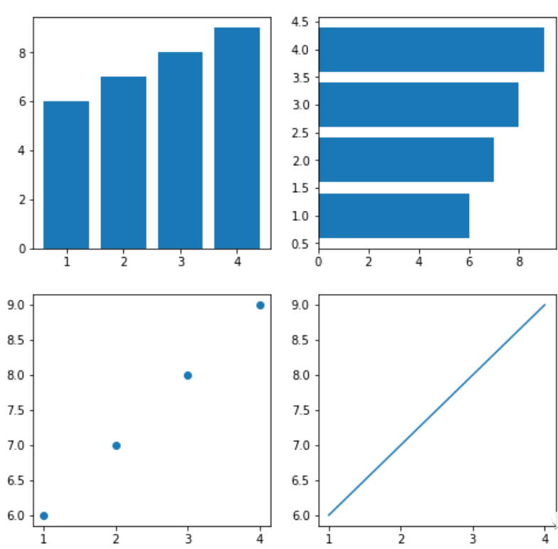
但是这种似乎就没办法指定子图的占据范围了,比如让第三张子图占据一整行。
两种绘图方式并没有优劣之分,看个人习惯,官网建议坚持一种方法而不是混合使用,一般来讲,在交互式环境下使用restrict pyplot方式绘图,例如jupyter notebook中,而在非交互项目中使用面向对象风格绘图,以下为官网原文:
Matplotlib's documentation and examples use both the OO and the pyplot approaches (which are equally powerful), and you should feel free to use either (however, it is preferable pick one of them and stick to it, instead of mixing them). In general, we suggest to restrict pyplot to interactive plotting (e.g., in a Jupyter notebook), and to prefer the OO-style for non-interactive plotting (in functions and scripts that are intended to be reused as part of a larger project).
参考:#matplotlib
https://matplotlib.org/stable/tutorials/introductory/pyplot.html