之前在数据可视化-matplotlib初步了解一文中介绍了些matplotlib的基础绘图方法,而在pandas中,可以使用plot()方法快速将Series和DataFrame中的数据可视化,该方法是matplotlib.axes.Axes.plot的封装。
在Series和DF中,都有一个plot属性,用于绘制图形。
先看下Series中的示例
s  = pd.Series(np.random.randn(10).cumsum(),
               index=np.arange(0,100,10))
s
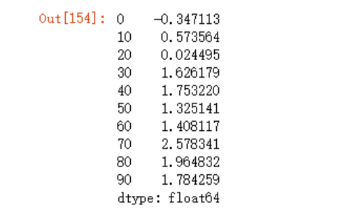
s.plot()
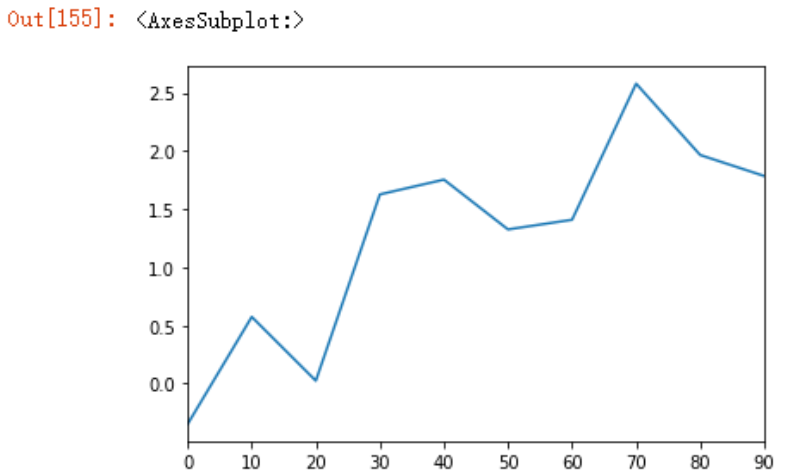
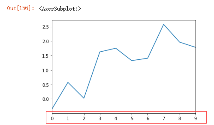
可以看到Series 使用 plot 时默认 x 轴为索引,但我们可以使用use_index参数禁用该功能
s.plot(use_index=False)
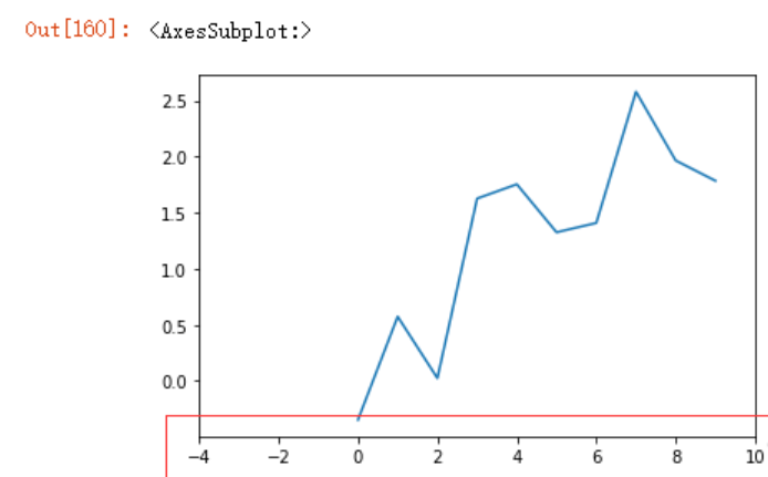
我们也可以使用xticks或xlim等参数,来定义x轴标签、刻度等,Y轴也是一样的道理
s.plot(use_index=False,
       xlim=(-4,10))
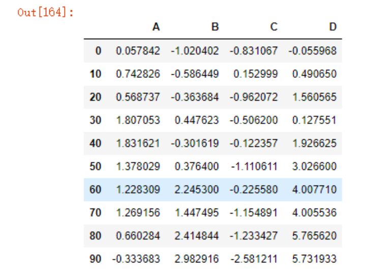
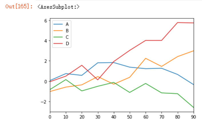
在DF中,DataFrame 使用 plot 时默认 x 轴为索引,y 轴为(x轴)索引对应的多个具体值:
df = pd.DataFrame(np.random.randn(10,4).cumsum(0),
                 columns=list("ABCD"),
                 index = np.arange(0,100,10))
df
df.plot()
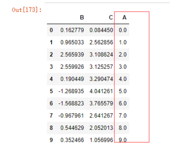
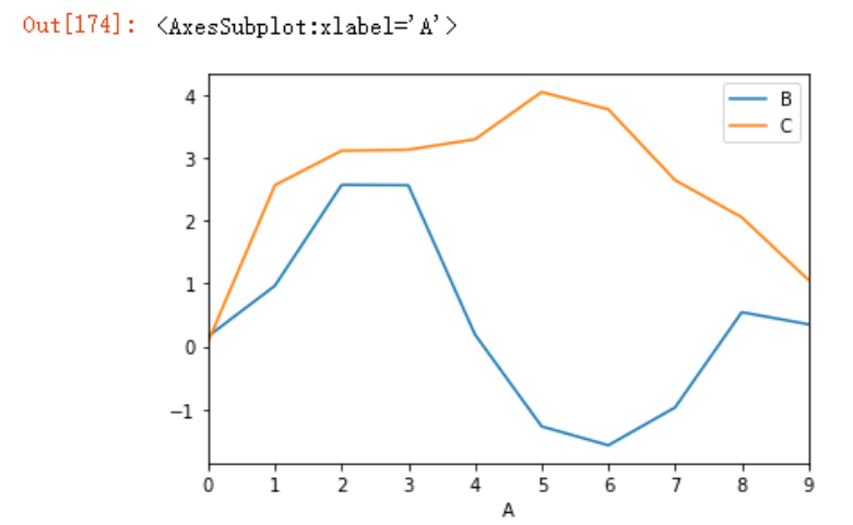
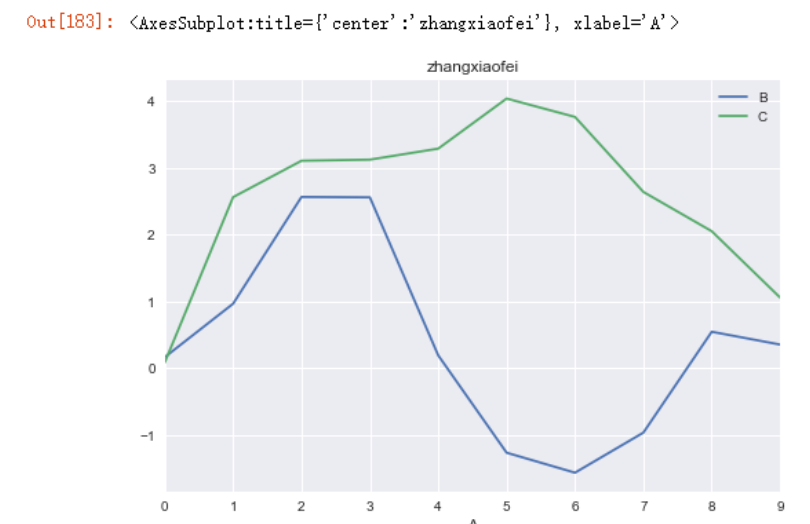
可以在DF绘图时指定X轴和Y轴的列
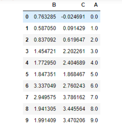
df3 = pd.DataFrame(np.random.randn(1000, 2), columns=['B', 'C']).cumsum()
df3['A'] = pd.Series(np.arange(10))
df3[:10]
df3.plot(x='A', y=['B','C']) # 指定 x 和 y 轴内容
需要注意的是,plot属性包含了不同绘图类型的方法族(方法集合),上面的df.plot()其实等价于df.plot.line()。
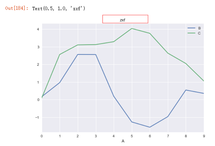
我们也可以使用不同的绘图风格让图片看的更加清晰明了,通过plt.style属性,例如
import matplotlib.pyplot as plt
plt.style.use('seaborn')
df3.plot(x='A', y=['B','C'],
         title="zhangxiaofei") # 指定 x 和 y 轴内容
绘图风格可以使用plt.style.available来获取
plt.style.available
['Solarize_Light2',
 '_classic_test_patch',
 '_mpl-gallery',
 '_mpl-gallery-nogrid',
 'bmh',
 'classic',
 'dark_background',
 'fast',
 'fivethirtyeight',
 'ggplot',
 'grayscale',
 'seaborn',
 'seaborn-bright',
 'seaborn-colorblind',
 'seaborn-dark',
 'seaborn-dark-palette',
 'seaborn-darkgrid',
 'seaborn-deep',
 'seaborn-muted',
 'seaborn-notebook',
 'seaborn-paper',
 'seaborn-pastel',
 'seaborn-poster',
 'seaborn-talk',
 'seaborn-ticks',
 'seaborn-white',
 'seaborn-whitegrid',
 'tableau-colorblind10']
设置标题可以使用pandas封装好的title属性来绘制,也可以使用matplotlib的title属性来绘制,但需要注意先后顺序(必须要放在plot函数之后),如下面注释的第二行代码
plt.style.use('seaborn')
# plt.title("zhangxiaofei")
df3.plot(x='A', y=['B','C']) # 指定 x 和 y 轴内容
plt.title("zxf")
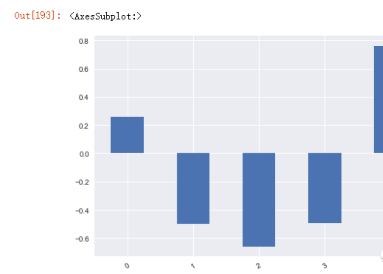
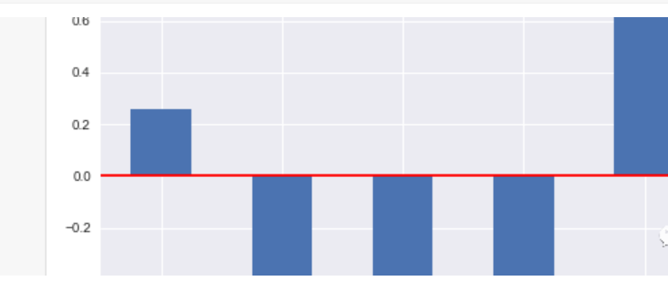
绘制柱状图
df3.B[:5].plot.bar(rot=30)
添加水平线
plt.axhline(0, color='r')
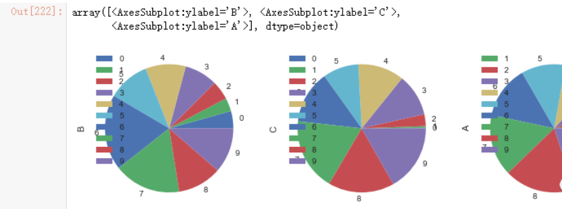
上面都是在一个图中绘制所有数据,但我们也可以通过subplots参数将数据绘制到不同的子图中
df4 = df3[:10]
df4
df4.abs().plot.pie(subplots=True, figsize=(12,6))
参考:
https://www.gairuo.com/p/pandas-plot
# matplotlib.axes.Axes.plot
https://matplotlib.org/stable/api/_as_gen/matplotlib.axes.Axes.plot.html